28: Email Well (Less Words, More Pics)
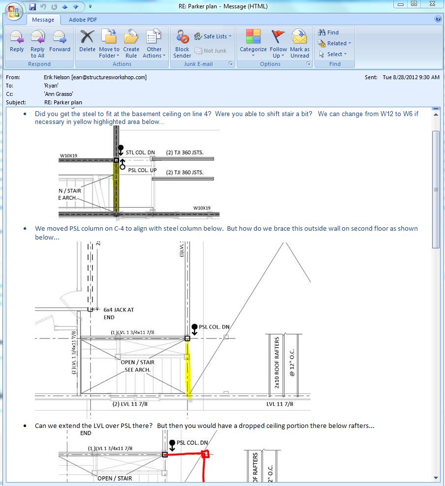
As a design community we email poorly - way too many words, not enough pictures/sketches/details/screen shots. It is still the coordination tool of choice today, but there isn't one way to email. Add lots of screen shots! Here is a bad email...
"Erik, On grid line 8 east of wall A, near the dining room wall, there is a post that needs to be moved 6" to the north. Remember, north is to the left on the PDF set you have. Sincerely, Bobby Cantemail"
Here is a good email...
